 Ishaan Bose
Enter the password to access

Developer tools are known for poor interfaces, as if the field is allergic to products that are both powerful and nice to look at. So I was glad to be tapped for UI improvements on HCP Terraform, a managed service for deploying and tracking cloud infrastructure. I’d mostly done feature work at HashiCorp, but I’m a proponent of continuously improving the overall experience. This project became a lesson in managing scope creep and turning an ambiguous brief into a redesign of the 4 highest-traffic pages.
Improve the UI of some of the high traffic pages of our application.
Hearing “make this look nicer” usually makes a designer’s eyes roll, but this time I welcomed it. Terraform Cloud’s UI had only seen incremental updates since its 2018 launch. Six years is a long time in design, and the product showed it.
The challenge, familiar to many SaaS companies, was balancing new feature demands (to reduce churn and win contracts) with addressing design and tech debt. While the project had executive backing from design and engineering, it lacked full company buy-in, most notably from product. This absence of true product management ownership reflected the fuzzy EPD structure around the project.
This theme of unclear ownership shaped much of what followed.
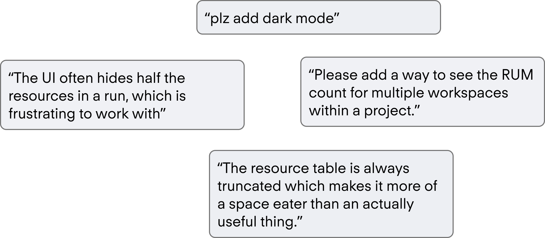
I conducted cognitive ethnography through social media, a method chosen for its efficiency in time and cost. Leveraging HashiCorp’s user base provided quick, free insights that formed a foundation for optimization. I supplemented this with ad-hoc feedback via anonymous Reddit surveys and in-app Snowflake forms.
Additionally, I analyzed familiar design patterns practitioners already use. By reusing these patterns, I reduced the need for relearning and made the new UI more efficient.
Users find significant friction in high traffic pages that don’t meet basic usability goals and force users to complete extra steps to consume data.
Next I engaged the internal liaisons for customers: the field and PMs. Both could point me toward larger UI pain points that had been collected but not prioritized, which helped justify the work. From there I built a simple affinity map and took a first pass at what an improvement could look like.
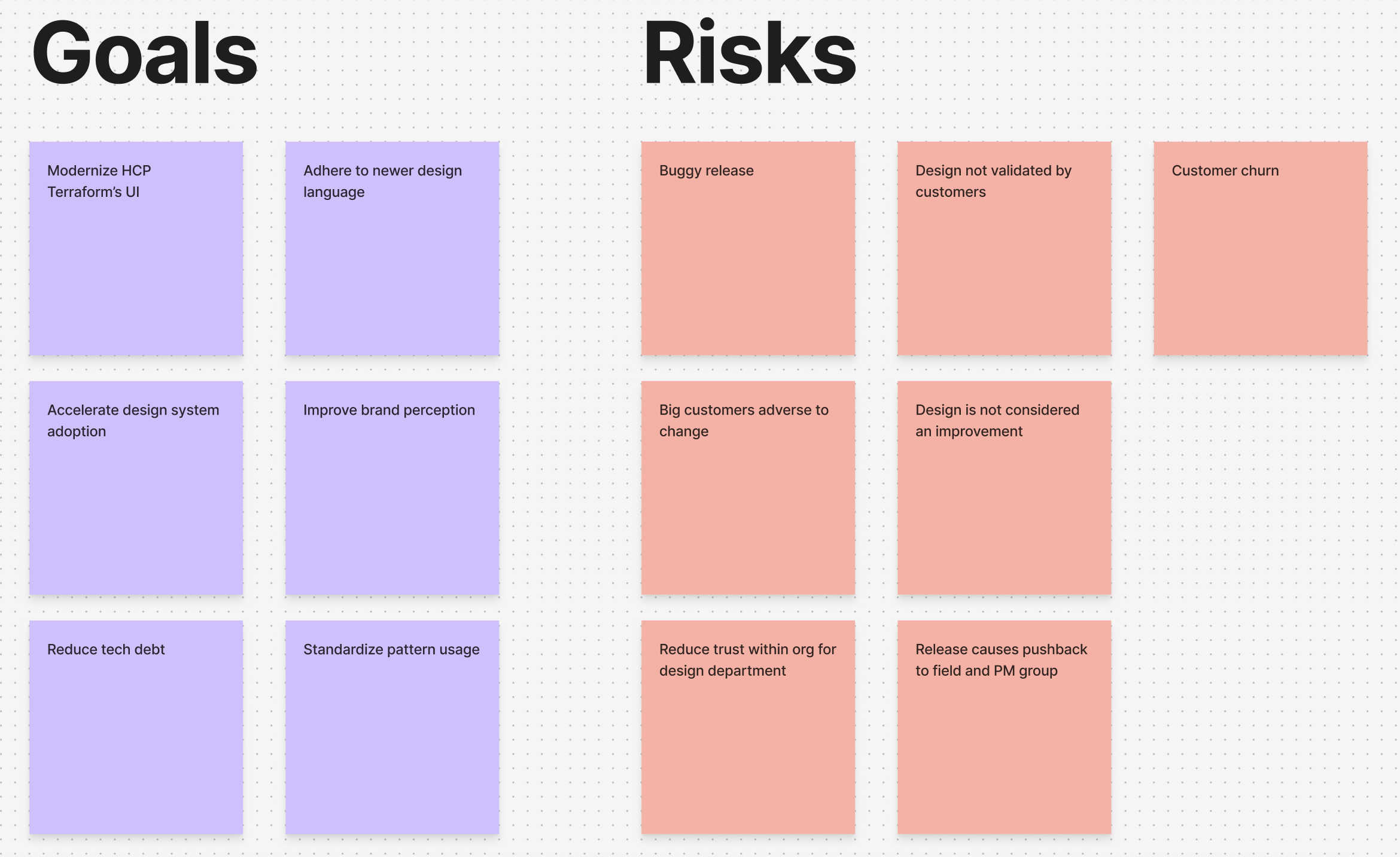
High traffic pages that the users land on influence brand perception, and in their current state don’t fit into the more evolved design language of newer features.
In order to get internal buy in, we must manage scope creep and provide clear foundational wins to the organization.
Deliver a highly scoped redesign of the 4 highest traffic pages on terraform to improve usability, accelerate design system adoption, and create a more recognizable design language without introducing new features.
From this design goal, we had a couple key parts of this project to decompose our ideation into:
Usability: Fix bugs, heuristic issues, and feedback points of these key pages
Accelerate design system adoption: Quantitative measure to show key win and match towards company goals.
Create recognizable design language: Use patterns that exist already and have been codified and validated by customers to reduce risk
No new functionality: New features needs product teams to own it, discovery on if customers need this, and a more defined product development process.
This allowed me to think more clearly about some of the pain points that exist and translating that to the new UI.
We used our internal SME's and power users to yield insights which informed our first concepts. With this, I tried to push the bar as much as I could visually, to see how customers would react.
The next step was ensuring the designs met the goals we set out to do. This was done through several customer calls where we went over the proposed designs and captured sentiment.
We also circulated the designs to customers through the field. The feedback was overwhelmingly positive, and I felt we were close to delivering something valuable.
Then we hit a roadblock. Product management grew uneasy that there was no product involvement, and what the blowback might be. Their fears were rooted in reality, and while frustrating, I saw their points:
1. Who would own this if it went spectacularly wrong?
2. Did this go through formal product development processes that we have internally?
3. What level of discovery was done here?
4. Why was this done in a silo?
I could have aimed to rebut each question, but rather than looking at it as an us vs them situation, I aimed to answer their core concern, which is risk.
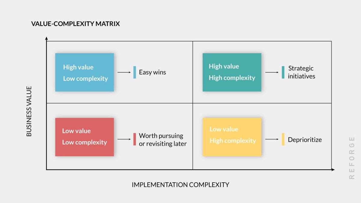
With UI based changes, the risk matrix often will tell the tale that it is not worth pursuing, in that often it can be categorized as low impact and high risk. After all, users likely won't buy your enterprise infrastructure software because of the UI, but existing customers absolutely will be upset if the UI changes drastically for the worse.
This included auditing patterns across the product, and workshopping a consistent language for how our product should look.
The surest way to de-risk a design is a large sample of users validating it, which gives you too much evidence to reject. I set out to do this two ways:
Raise awareness internally of the changes and get field buy in
Connect with customers directly and understand their general sentiment
Internal awareness started with the people closest to customers: sales and solution architects. I reached out to 10 reps across different customer segments and ran concept validation tests, walking them through the designs.
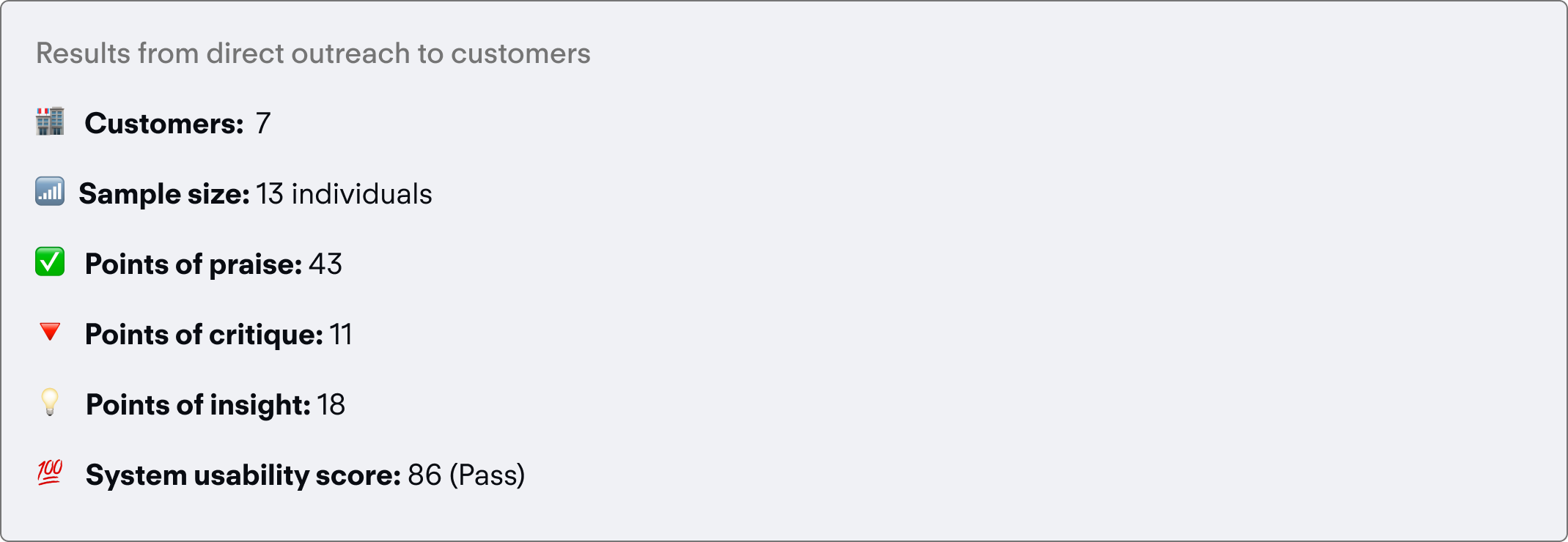
My most daring bet was de-risking through a direct customer survey. If I could reach 1k+ users and get sentiment that the designs were a true improvement, I’d be confident they were safe. I pulled a list of active users who’d provisioned a workspace through the UI, confirming they were my target persona, then ran it through Marketo to exclude anyone who’d opted out of communication.
With those two steps done, leadership was easier to convince. I’d proved the designs were better and worth building, and got buy-in org-wide to invest engineering capacity. I had to concede on headcount though: only 1 FTE was allotted.
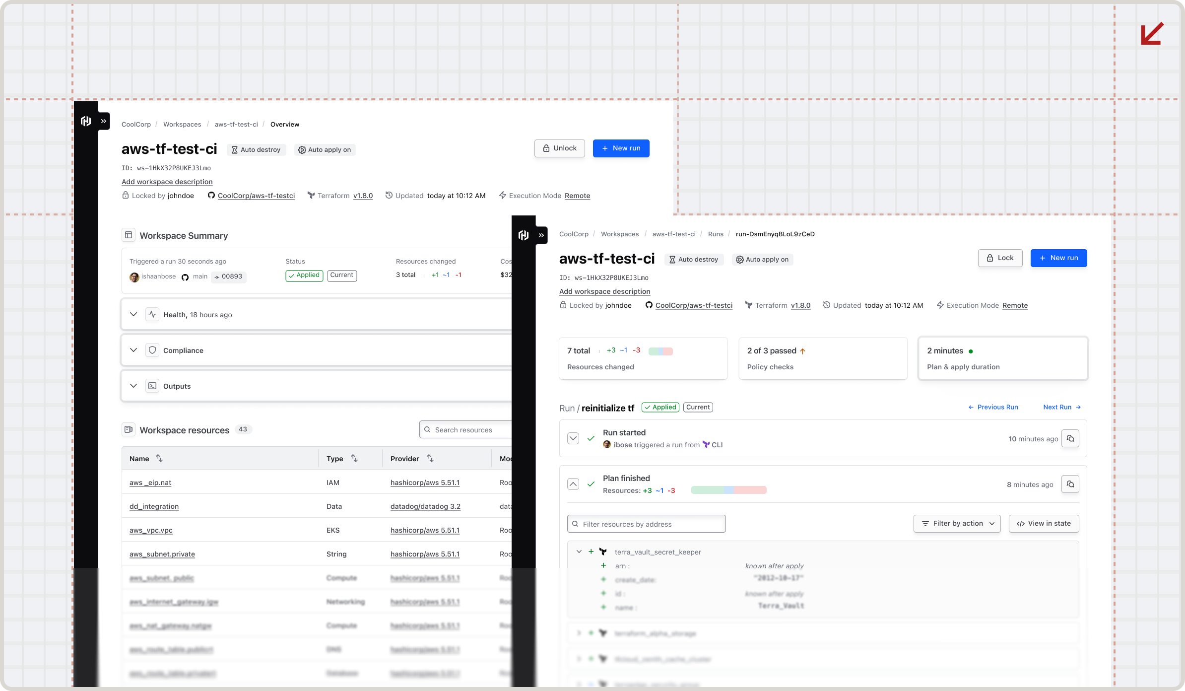
The new design focused on minimalism, which was the new design standard that was being brought through in other areas of the product, while trying to keep the pages as actionable as possible.
Goal: Make the page more actionable
The list previously used distracting badges and wasn't very easy to skim. Rearranging status to be more modern felt like the right way forward.
Goal: Make the list easier to skim, and pull the more important information to the top.
Considerations: This page is the central landing page of the workspace, the fundamental unit of Terraform. However, this page lacks actionability, and as a result isn't a part of a customer workflow too often.
To make it more actionable, I tried using color more thoughtfully.
Goal: Reduce visual fatigue on the list.
Considerations: This list can be many rows long, we need this to be as skimmable as possible and reorient the information to be more actionable. The previous version overemphasized the avatar, which can many times be a bot conducting a job when using the terraform API.
Goal: Reduce visual fatigue, and increase actionability.
Considerations: The color used previously made it easy to see high level operations but was a strain to look at. Also considering user behavior, customers don't come to this page unless they are debugging, which is the critical user journey we need to support, hence the high level info cards.
This refresh touched a product used by tens of thousands of practitioners daily, so the impact was wide and immediate. The hardest part wasn’t the design work, it was convincing others that change was necessary. Early concepts and visuals did that better than any argument, showing what a modernized Terraform Cloud could feel like. The UI turned out to be more than surface polish. It reinforced how mature and trustworthy the product felt at scale.